

Why Your Book needs a Layout Artist (and Why Word is Not Your Friend).
You’ve done the hard part — you’ve written a book. You’ve laboured over plot twists, perfected sentences, maybe sacrificed sleep, weekends, and a little sanity.
But before it can win readers, it has to pass a test they’ll never consciously think about: does it look like a real book?
I’m Christopher Tanser, author, book layout artist, typesetter, and the one who will make sure your interior pages don’t just hold your words — they present them beautifully, following industry standards so your book can sit proudly alongside traditionally published titles.
What I Do
A layout artist transforms your manuscript into a polished, professional interior — one that works in both print and digital formats. I make sure:
-
Fonts are chosen for readability and tone.
-
Margins and line spacing are balanced for comfort.
-
Page numbers, headers, and footers are consistent.
-
Orphans and widows (stray lines) are eliminated.
-
Chapter openings look elegant and inviting.
-
Front and back matter are correctly structured.
When it’s done right, readers don’t notice the design — they simply enjoy the story. When it’s done wrong, they notice everything.
Why Word won't cut it
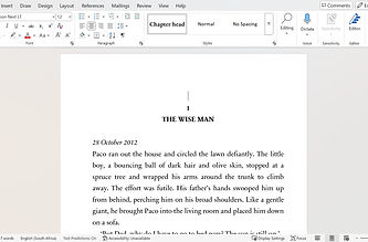
Sure, you can try to format your book in Word. But you’ll be fighting a tool that was built for letters and office documents, not professional publishing.
Expect:
-
Paragraph indents that shift unpredictably.
-
Justification that creates ugly “rivers” of white space.
-
Page numbers that refuse to behave.
-
Fonts that look like a high school essay.
-
Single lines stranded at the top or bottom of pages.
-
Zero tolerance for artistic leeway
And here’s the real problem: Word doesn’t know the rules of the publishing world. I do.


-
Plain, unwelcoming chapter titles with no style or hierarchy.
-
Generic font that looks unprofessional.
-
Uneven spacing and poor justification disrupting flow.
-
Clumsy scene breaks confusing transitions.
-
Overall appearance feels distracting and amateurish, more like a document than a real book.
-
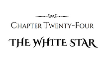
Elegant, consistent chapter titles with polished spacing.
-
Carefully chosen fonts that enhance readability and harmony.
-
Balanced layout with smooth, comfortable text flow.
-
Stylish, consistent scene dividers guiding the reader clearly.
-
Every page feels cohesive, professional, and bookstore-quality—giving the story the presentation it truly deserves.
Your Readers notice more than you think
A reader won’t say, “This book’s leading is 1.5 points too tight,” but they’ll feel it — in eyestrain, in awkward page turns, in a subtle sense that something’s “off.” In a crowded market, small irritations are all it takes to turn a potential fan into a lost sale.
A clean, professional layout creates a smooth reading experience and makes your book feel credible.
That first impression is priceless.
Why I'm more affordable
Most layout artists charge corporate-level rates — often exceeding R20 000 or R30 000 for a standard length novel!
I don’t.
Because I work directly with authors, keep my workflow efficient, and don’t pay agency overheads, I can offer professional, industry-standard results at a fraction of those prices. You keep more of your budget for marketing, cover design, or even your next book.
What you get when you work with me
-
Print-ready PDF for your chosen trim size(s).
-
E-book formatting that mirrors your print design’s elegance.
-
Correctly structured front and back matter that matches industry requirements.
-
Typographic choices optimised for genre and audience.
-
Consistent, flawless page numbering and headings.
-
Attention to detail that removes distractions before they reach your reader.

The Process is Simple
-
Send me your manuscript — A Word document is fine at this stage.
-
Tell me your goals and specifications — genre, audience, trim size, print vs. e-book.
-
I’ll send a quote — and you’ll see I’m significantly more affordable than most pros.
-
We get to work — you’ll get updates as your manuscript transforms into a book that looks ready for any shelf. Your finished product will be ready within 2 - 4 weeks.
The Bottom Line
Self-publishing gives you freedom — but that freedom comes with responsibility. You’re not just the author; you’re also the publisher.
Every part of your book, from cover to interior, tells the reader what to expect. A professional layout tells them: this author takes their work seriously. This book is worth your time and money.
If you’ve done the work of writing, let me do the work of making it look like it belongs on the shelves next to the books that inspired you.
Let's make your book look as good as it reads!